Modular
Every pack follows the same underlying system, making it easy to introduce new products without starting from scratch.
Loading our latest work…

Nootie is a modern pet wellness brand creating meals, treats, supplements and everyday care products for dogs and cats.
The brand grew out of Pet Point, a family-run pet care business that began in Delhi in 2005. Years of working closely with pet parents shaped Nootie long before its first product reached the shelf.
Following its appearance on Shark Tank India, the brand entered a new chapter. It was the right moment to step back and rethink how the brand would grow from here.
Before designing anything new, we spent time understanding what was already there. Looking at the portfolio as a whole revealed patterns, inconsistencies and opportunities that weren't obvious when each product was viewed on its own.


Every growing brand needs a clear structure behind it. We began by organising Nootie's portfolio into a brand architecture that could make today's products easier to navigate and tomorrow's products easier to introduce.

With the architecture in place, the next step was defining a design system that could bring consistency across the portfolio. These principles became the foundation for every pack that followed.
Every pack follows the same underlying system, making it easy to introduce new products without starting from scratch.
Colour, hierarchy and key brand elements work together to make every product feel unmistakably Nootie.
Ingredients, nutrition and product information take priority, helping pet parents make informed decisions quickly.
The system adapts to new categories, formats and variants while keeping the portfolio connected.


Every brand has elements people remember. For Nootie, those became a family of illustrated characters that added warmth, familiarity and a little personality to every product.
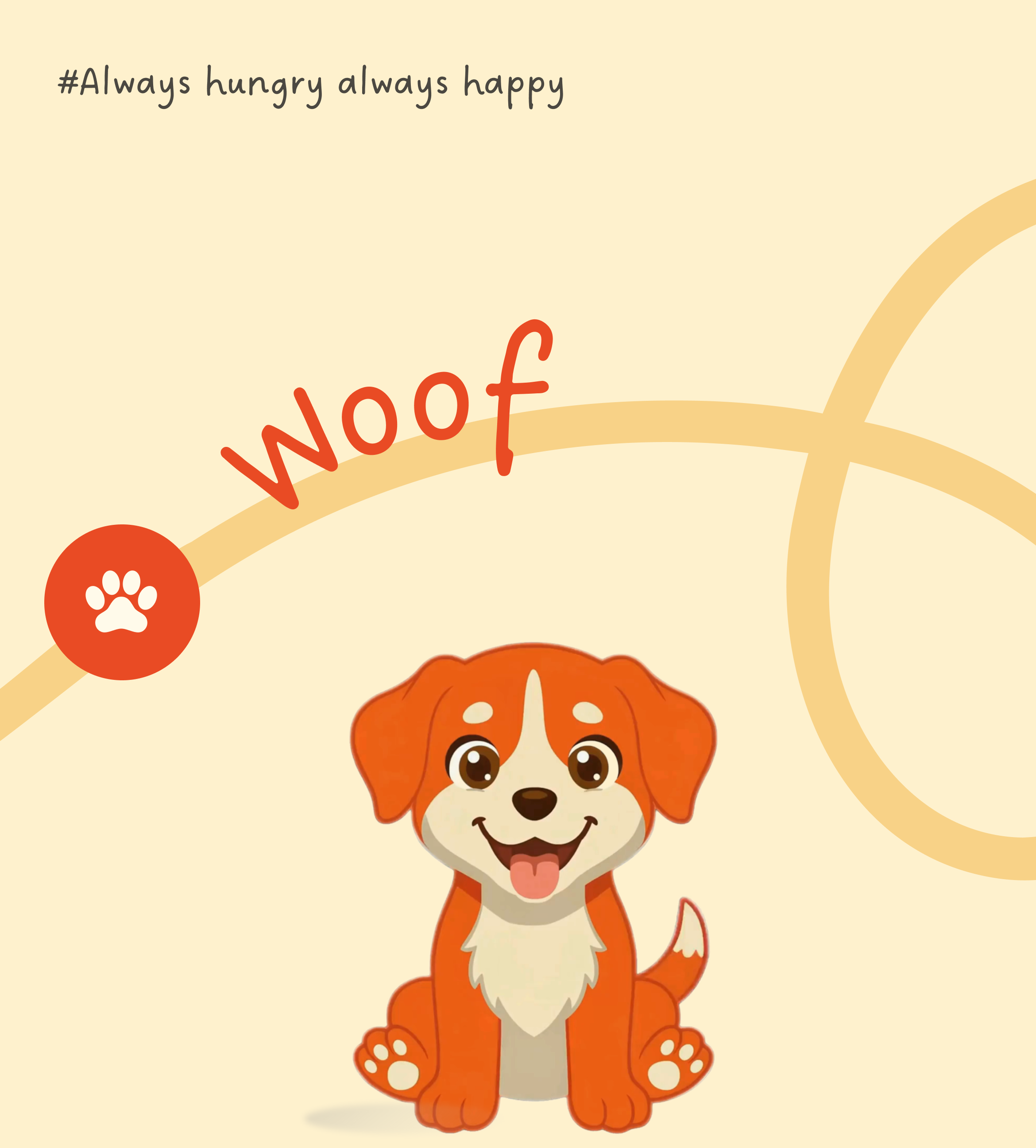
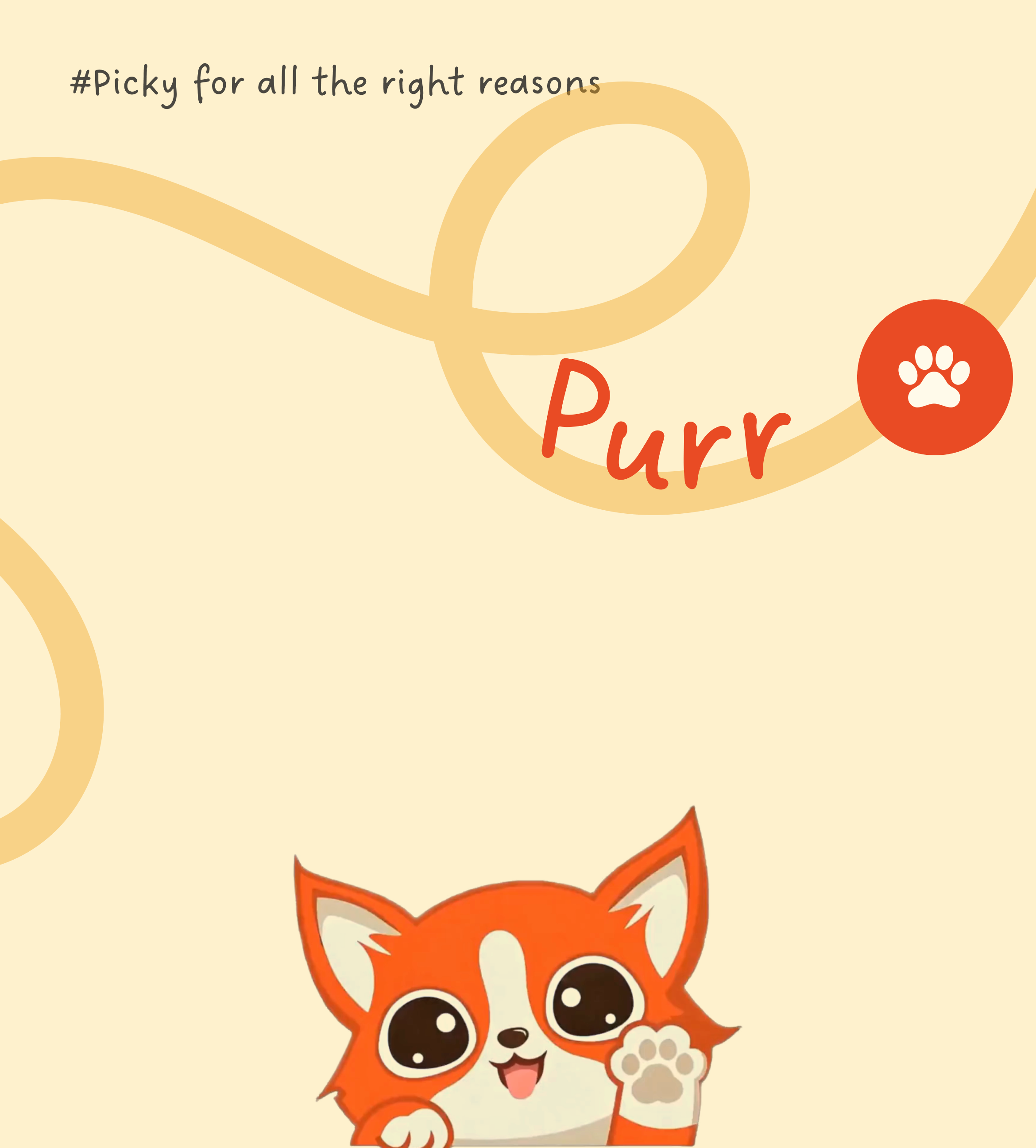
The identity positions the brand with a clear point of view, evolving its language across categories while keeping its core personality intact.
The first category to take shape under Woof was Nibblr, Nootie's ready-to-eat wet meal range. Organised into Daily and Special.


The front is designed to answer the first few questions quickly: what is it, what's in it, and why should I care? Turn the pack around and the details take over, from the founder story to nutrition, feeding information and lab reports.


Rather than creating a new identity, Woof Broth builds on the same system, proving how the packaging can adapt across formats without losing familiarity.


Moving from dogs to cats called for a different visual language. While the underlying system stayed the same, the colours, illustrations and category cues were thoughtfully adapted for the world of Purr.


The next category to take shape was Nootie Rewards, Nootie's biscuit and treat range. Built around everyday moments, it carries the same foundation with a distinct personality of its own.
The first product range under Nootie Rewards was Woof Biscuits, created for both Adult and Puppy dogs. A clear product window lets the biscuits speak for themselves, making it easier for pet parents to see exactly what they're bringing home.


Pet parents rarely read every detail before choosing a product. They first look for the right meal, then the recipe, and finally evaluate its nutritional value. The packaging was designed around this natural decision-making process, presenting information in a clear and predictable order that makes products easier to recognise, compare, and understand.
What we like most about the final system is how naturally everything comes together. The categories can have their own character, the products can feel different, but the Nootie connection is always there.